Depois que seu primeiro aplicativo React Native tiver sido criado e estiver em funcionamento, talvez você queira reutilizar determinados elementos como componentes funcionais. Esses componentes podem então ser configurados para outros aplicativos e compartilhados como uma biblioteca.
Descrição
Neste tutorial, vamos começar com um aplicativo simples contendo quatro botões. Vamos criar um componente funcional React Native configurável em um arquivo de origem que reutilizaremos no arquivo principal do aplicativo.
Veremos como:
- transmitir propriedades a um componente
- obter dados de componentes a partir de eventos
- utilizar um componente definido num ficheiro fonte no ficheiro principal
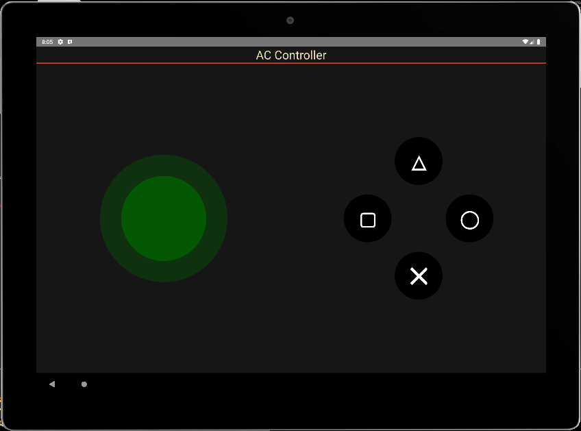
Aplicação básica: 4 botões
Neste código, temos uma vista principal (View) que cobre o ecrã, o título da aplicação e a vista que contém os 4 botões. As funções executadas quando os botões são premidos e os estilos definidos.
/**
 * https://github.com/jim-at-jibba/react-native-game-pad
 * https://github.com/ionkorol/react-native-joystick
 *
 */
import React from "react";
import { StyleSheet, Text, TouchableOpacity, View } from "react-native";


const GamePad = () =>  {

  let btnAColor = "red",
      btnBColor = "orange",
      btnXColor = "royalblue",
      btnYColor = "limegreen"

  const onButtonAPress = () => {
    console.log('You clicked button A');
  };
  const onButtonBPress = () => {
    console.log('You clicked button B');
  };

  const onButtonXPress = () => {
    console.log('You clicked button X');
  };
  const onButtonYPress = () => {
    console.log('You clicked button Y');
  };


    return (
      <View style={styles.mainBody}>
          <Text
            style={styles.mainTitle}>
            AC Controller
          </Text>
          <View style={{ flex: 1,justifyContent: "center", alignItems: "center",}}>
              <View
                style={{
                  //flex: 1,
                  justifyContent: "center",
                  alignItems: "center",
                  //backgroundColor:"green",
                  zIndex: 100,
                }}
              >
                <TouchableOpacity
                  style={[styles.button, {  top:"30%",backgroundColor: `${btnXColor}` }]} //top:"30%", right:"1%",
                  onPress={() => onButtonXPress()}
                >
                  <Text style={styles.buttonText}>X</Text>
                </TouchableOpacity>
              </View>

              <View
                style={{
                  //flex: 1,
                  justifyContent: "center",
                  alignItems: "center",
                  //backgroundColor:"gold",
                }}
              >
                <TouchableOpacity
                  style={[styles.button, { top: "50%", right:"20%", backgroundColor: `${btnYColor}` }]} //top:"2%", left:"10%",
                  onPress={() => onButtonYPress()}
                >
                  <Text style={styles.buttonText}>Y</Text>
                </TouchableOpacity>
              </View>

              <View
                style={{
                  //flex: 1,
                  justifyContent: "center",
                  alignItems: "center",
                  //backgroundColor:"blue",
                }}
              >
                <TouchableOpacity
                  style={[styles.button, { bottom:"50%", left:"20%", backgroundColor: `${btnAColor}` }]} //bottom:"2%",
                  onPress={() => onButtonAPress()}
                >
                  <Text style={styles.buttonText}>A</Text>
                </TouchableOpacity>
              </View>


            <View
                style={{
                  //flex: 1,
                  justifyContent: "center",
                  alignItems: "center",
                  //backgroundColor:"red",
                }}
              >
                <TouchableOpacity
                  style={[styles.button, { bottom:"30%", backgroundColor: `${btnBColor}` }]} //bottom:"30%", left:"1%",
                  onPress={() => onButtonBPress()}
                >
                  <Text style={styles.buttonText}>B</Text>
                </TouchableOpacity>
              </View>

          </View>
      </View>

    );
}
export default GamePad;

//parameters
let BACKGROUND_COLOR = "#161616"; //191A19
let BUTTON_COLOR = "#346751"; //1E5128
let ERROR_COLOR = "#C84B31"; //4E9F3D
let TEXT_COLOR = "#ECDBBA"; //D8E9A8

const styles = StyleSheet.create({

  mainBody: {
    flex:1,
    justifyContent: 'center',
    alignItems: "center",
    color:TEXT_COLOR,
    backgroundColor: BACKGROUND_COLOR,
  },

  mainTitle:{
    color: TEXT_COLOR,
    fontSize: 30,
    textAlign: 'center',
    borderBottomWidth: 2,
    borderBottomColor: ERROR_COLOR,
    width:"100%"
  },

  button: {
    height: 90,
    width: 90,
    borderRadius: 90 / 2,
    justifyContent: "center",
    alignItems: "center"
  },
  buttonText: {
    fontSize: 22,
    color: "white",
    fontWeight: "700"
  },


});
ao premir os botões, as funções do evento são executadas corretamente
 BUNDLE  ./index.js

 LOG  Running "CustomApp" with {"rootTag":31}
 LOG  You clicked button Y
 LOG  You clicked button X
 LOG  You clicked button A
 LOG  You clicked button B
Chamar o componente a partir de um ficheiro fonte
Vamos colocar esse código em um arquivo .
Para a podermos utilizar, utilizamos a palavra-chave export para definir a função
export const ButtonPad = ()  =>  {
...
}
O componente pode então ser utilizado importando-o
import {ButtonPad} from "./src/ACJoysticks";
const GamePad = () =>  {
    return (
      <View style={styles.mainBody}>
          <Text
            style={styles.mainTitle}>
            AC Controller
          </Text>
          <ButtonPad/>
      </View>

    );
};
export default GamePad;
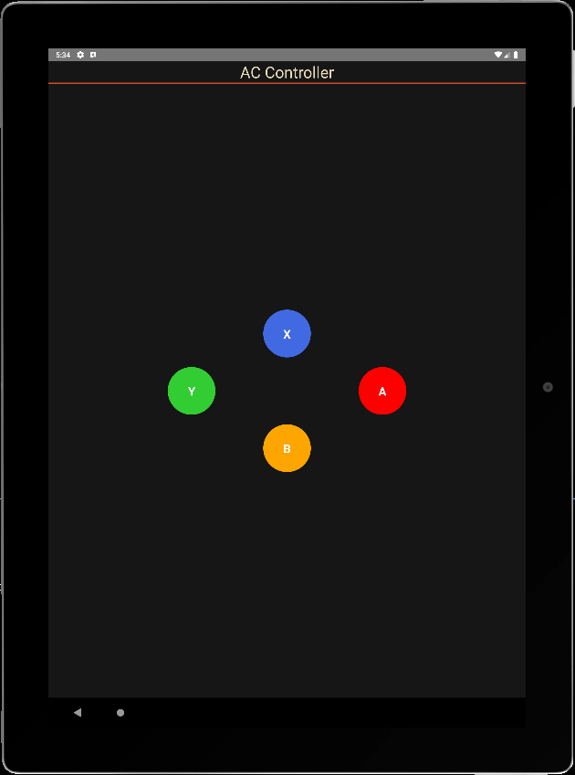
Transmissão de propriedades para um componente funcional
Para tornar o componente configurável, definimos parâmetros no ficheiro principal que serão passados para as propriedades do componente. As propriedades que queremos passar para o componente são:
- o texto apresentado nos botões
- a cor dos botões
- o tamanho dos botões
- a função onClick, que gere todos os botões
Os parâmetros do componente são colocados num tipo ButtonPadProps
type ButtonPadProps = {
  radius?: number;
  names?: string[4];
  colors?: string[4];
  onClick?:(evt: ButtonPadEvent) => void;
};
Podemos então definir estas propriedades como entrada para o componente e chamá-las com valores predefinidos.
export const ButtonPad = (props : ButtonPadProps)  =>  {
  const { onClick, radius = 45, names= ['X','Y','A','B'], colors = ["royalblue","limegreen","red","orange"] } = props;
Definimos uma única função para chamar os botões
  const onButtonPress = (index:number) => {
    console.log('You clicked button ' + names[index]);
  };
Por fim, modificamos o código para ter em conta as diferentes propriedades.
/**
 * ButtonPad
 */

type ButtonPadProps = {
  radius?: number;
  names?: Array<string>;
  colors?: Array<string>;
  onClick?:(evt: ButtonPadEvent) => void;
};

export const ButtonPad = (props : ButtonPadProps)  =>  {
  const { onClick, radius = 45, names= ['X','Y','A','B'], colors = ["royalblue","limegreen","red","orange"] } = props;
  let textSize = radius;

  const onButtonPress = (index:number) => {
    console.log('You clicked button ' + names[index]);
  };


    return (

          <View style={{ flex: 1,justifyContent: "center", alignItems: "center",}}>
              <View
                style={{
                  //flex: 1,
                  justifyContent: "center",
                  alignItems: "center",
                  //backgroundColor:"green",
                  zIndex: 100,
                }}
              >
                <TouchableOpacity
                  style={[{
                    height: 2*radius,
                    width: 2*radius,
                    borderRadius: radius,
                    justifyContent: "center",
                    alignItems: "center"
                  }, {  top:"30%",backgroundColor: `${colors[0]}` }]} //top:"30%", right:"1%",
                  onPress={() => onButtonPress(0)}
                >
                  <Text style={{
                            fontSize: textSize,
                            color: "white",
                            fontWeight: "700"
                          }}>{names[0]}</Text>
                </TouchableOpacity>
              </View>

              <View
                style={{
                  //flex: 1,
                  justifyContent: "center",
                  alignItems: "center",
                  //backgroundColor:"gold",
                }}
              >
                <TouchableOpacity
                  style={[{
                    height: 2*radius,
                    width: 2*radius,
                    borderRadius: radius,
                    justifyContent: "center",
                    alignItems: "center"
                  }, { top: "50%", right:"20%", backgroundColor: `${colors[1]}` }]} //top:"2%", left:"10%",
                  onPress={() => onButtonPress(1)}
                >
                  <Text style={{
                            fontSize: textSize,
                            color: "white",
                            fontWeight: "700"
                          }}>{names[1]}</Text>
                </TouchableOpacity>
              </View>

              <View
                style={{
                  //flex: 1,
                  justifyContent: "center",
                  alignItems: "center",
                  //backgroundColor:"blue",
                }}
              >
                <TouchableOpacity
                  style={[{
                    height: 2*radius,
                    width: 2*radius,
                    borderRadius: radius,
                    justifyContent: "center",
                    alignItems: "center"
                  }, { bottom:"50%", left:"20%", backgroundColor: `${colors[2]}` }]} //bottom:"2%",
                  onPress={() => onButtonPress(2)}
                >
                  <Text style={{
                            fontSize: textSize,
                            color: "white",
                            fontWeight: "700"
                          }}>{names[2]}</Text>
                </TouchableOpacity>
              </View>


            <View
                style={{
                  //flex: 1,
                  justifyContent: "center",
                  alignItems: "center",
                  //backgroundColor:"red",
                }}
              >
                <TouchableOpacity
                  style={[{
                    height: 2*radius,
                    width: 2*radius,
                    borderRadius: radius,
                    justifyContent: "center",
                    alignItems: "center"
                  }, { bottom:"30%", backgroundColor: `${colors[3]}` }]} //bottom:"30%", left:"1%",
                  onPress={() => onButtonPress(3)}
                >
                  <Text style={{
                            fontSize: textSize,
                            color: "white",
                            fontWeight: "700"
                          }}>{names[3]}</Text>
                </TouchableOpacity>
              </View>

          </View>
    );
}
Passagem de dados do componente para a aplicação
Para devolver os dados à aplicação principal, utilizamos uma interface que contém os estados dos botões e o nome do botão premido
interface ButtonPadEvent {
  states : Array<boolean>;
  pressed: string;
}
Modificamos a função onButtonPress para alimentar os estados e enviá-los para a função onClick.
  const onButtonPress = (index:number) => {

    let btnStates= [false,false,false,false];
    btnStates[index] = true;

    if(typeof(onClick)==="function"){
      onClick({
             states: btnStates,
             pressed: names[index]
         });
       }
  };
N.B.: A notação if(typeof(onClick)===”function”){ onClick() } é equivalente a onClick && onClick()
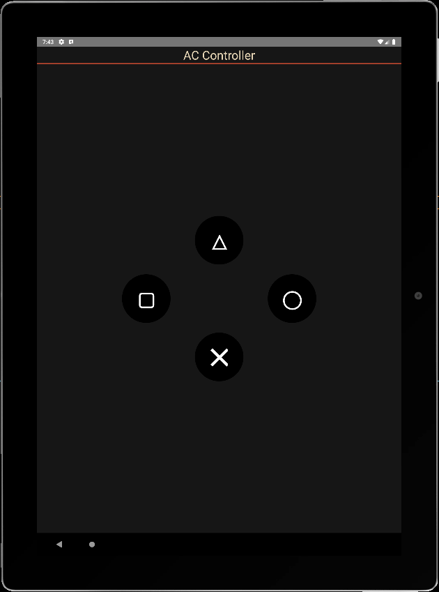
Podemos agora chamar o nosso componente na aplicação principal, criar uma função de escuta e modificar os seus parâmetros.
const GamePad = () =>  {
  const onPadClick = (data: any) => {
    console.log("form ButtonPad: ",data);
  }
    return (
      <View style={styles.mainBody}>
          <Text
            style={styles.mainTitle}>
            AC Controller
          </Text>
          <ButtonPad radius={60} names={['\u2573', '\u25EF', '\u25B3', "\u25A2"]} colors={['black', 'black', 'black', 'black']} onClick={onPadClick} />
      </View>

    );
}
export default GamePad;
info Reloading app...
 BUNDLE  ./index.js

 LOG  Running "CustomApp" with {"rootTag":81}
 LOG  form ButtonPad:  {"pressed": "╳", "states": [true, false, false, false]}
 LOG  form ButtonPad:  {"pressed": "△", "states": [false, false, true, false]}
 LOG  form ButtonPad:  {"pressed": "▢", "states": [false, false, false, true]}
 LOG  form ButtonPad:  {"pressed": "◯", "states": [false, true, false, false]}
N.B.: para fazer as coisas corretamente, teria de criar os observadores onPressIn e onPressOut para repor os estados a zero e modificar a lógica para ouvir vários botões ao mesmo tempo.
Código completo
./src/ACJoysticks.tsx
/**
 * ButtonPad
 */

interface ButtonPadEvent {
  states : Array<boolean>;
  pressed: string;
}

type ButtonPadProps = {
  radius?: number;
  names?: Array<string>;
  colors?: Array<string>;
  onClick?:(evt: ButtonPadEvent) => void;
};


export const ButtonPad = (props : ButtonPadProps)  =>  {
  const { onClick, radius = 45, names= ['X','Y','A','B'], colors = ["royalblue","limegreen","red","orange"] } = props;
  let textSize = radius;
  let btnStates= [false,false,false,false];

  const onButtonPress = (index:number) => {
    btnStates[index] = true;

    if(typeof(onClick)==="function"){
      onClick({
             states: btnStates,
             pressed: names[index]
         });
       }
  };

  const onButtonRel = (index:number) => {
    btnStates[index] = false;

    if(typeof(onClick)==="function"){
      onClick({
             states: btnStates,
             pressed: names[index]
         });
       }
  };

    return (

          <View style={{ flex: 1,justifyContent: "center", alignItems: "center",}}>
              <View
                style={{
                  //flex: 1,
                  justifyContent: "center",
                  alignItems: "center",
                  //backgroundColor:"green",
                  zIndex: 100,
                }}
              >
                <TouchableOpacity
                  style={[{
                    height: 2*radius,
                    width: 2*radius,
                    borderRadius: radius,
                    justifyContent: "center",
                    alignItems: "center"
                  }, {  top:"30%",backgroundColor: `${colors[0]}` }]} //top:"30%", right:"1%",
                  //onPress={() => onButtonPress(0)}
                  onPressIn={() => onButtonPress(0)}
                  onPressOut={() => onButtonRel(0)}
                >
                  <Text style={{
                            fontSize: textSize,
                            color: "white",
                            fontWeight: "700"
                          }}>{names[0]}</Text>
                </TouchableOpacity>
              </View>

              <View
                style={{
                  //flex: 1,
                  justifyContent: "center",
                  alignItems: "center",
                  //backgroundColor:"gold",
                }}
              >
                <TouchableOpacity
                  style={[{
                    height: 2*radius,
                    width: 2*radius,
                    borderRadius: radius,
                    justifyContent: "center",
                    alignItems: "center"
                  }, { top: "50%", right:"20%", backgroundColor: `${colors[1]}` }]} //top:"2%", left:"10%",
                  //onPress={() => onButtonPress(1)}
                  onPressIn={() => onButtonPress(1)}
                  onPressOut={() => onButtonRel(1)}
                >
                  <Text style={{
                            fontSize: textSize,
                            color: "white",
                            fontWeight: "700"
                          }}>{names[1]}</Text>
                </TouchableOpacity>
              </View>

              <View
                style={{
                  //flex: 1,
                  justifyContent: "center",
                  alignItems: "center",
                  //backgroundColor:"blue",
                }}
              >
                <TouchableOpacity
                  style={[{
                    height: 2*radius,
                    width: 2*radius,
                    borderRadius: radius,
                    justifyContent: "center",
                    alignItems: "center"
                  }, { bottom:"50%", left:"20%", backgroundColor: `${colors[2]}` }]} //bottom:"2%",
                  //onPress={() => onButtonPress(2)}
                  onPressIn={() => onButtonPress(2)}
                  onPressOut={() => onButtonRel(2)}
                >
                  <Text style={{
                            fontSize: textSize,
                            color: "white",
                            fontWeight: "700"
                          }}>{names[2]}</Text>
                </TouchableOpacity>
              </View>


            <View
                style={{
                  //flex: 1,
                  justifyContent: "center",
                  alignItems: "center",
                  //backgroundColor:"red",
                }}
              >
                <TouchableOpacity
                  style={[{
                    height: 2*radius,
                    width: 2*radius,
                    borderRadius: radius,
                    justifyContent: "center",
                    alignItems: "center"
                  }, { bottom:"30%", backgroundColor: `${colors[3]}` }]} //bottom:"30%", left:"1%",
                  //onPress={() => onButtonPress(3)}
                  onPressIn={() => onButtonPress(3)}
                  onPressOut={() => onButtonRel(3)}
                >
                  <Text style={{
                            fontSize: textSize,
                            color: "white",
                            fontWeight: "700"
                          }}>{names[3]}</Text>
                </TouchableOpacity>
              </View>

          </View>
    );
}
./App.tsx
import React from "react";
import { StyleSheet, Text, TouchableOpacity, View } from "react-native";
import {ButtonPad} from "./src/ACJoysticks";

const GamePad = () =>  {
  const onPadClick = (data: any) => {
    console.log("from ButtonPad: ",data);
    //data.states[0], data.pressed
  }

    return (
      <View style={styles.mainBody}>
          <Text
            style={styles.mainTitle}>
            AC Controller
          </Text>
          <ButtonPad radius={60} names={[ '\u25B3', '\u25A2', '\u25EF',  '\u2573',]} colors={['black', 'black', 'black', 'black']} onClick={onPadClick} />
      </View>

    );
}
export default GamePad;

//parameters
let BACKGROUND_COLOR = "#161616"; //191A19
let BUTTON_COLOR = "#346751"; //1E5128
let ERROR_COLOR = "#C84B31"; //4E9F3D
let TEXT_COLOR = "#ECDBBA"; //D8E9A8

const styles = StyleSheet.create({

  mainBody: {
    flex:1,
    justifyContent: 'center',
    alignItems: "center",
    color:TEXT_COLOR,
    backgroundColor: BACKGROUND_COLOR,
  },

  mainTitle:{
    color: TEXT_COLOR,
    fontSize: 30,
    textAlign: 'center',
    borderBottomWidth: 2,
    borderBottomColor: ERROR_COLOR,
    width:"100%"
  },
});
Aplicações
- Criar componentes reutilizáveis e configuráveis para as suas aplicações
- Criar aplicações para controlar os seus projectos através de Bluetooth, BLE ou Wifi