Once your first React Native application is up and running, you may want to reuse certain elements as functional components. These components can then be configured for other applications and shared as a library.
Description
In this tutorial, we’ll start with a simple application containing four buttons. We’ll create a configurable React Native functional component in a source file, which we’ll reuse in the main application file.
We’ll see how:
- pass properties to a component
- retrieve component data from events
- use a component defined in a source file in the main file
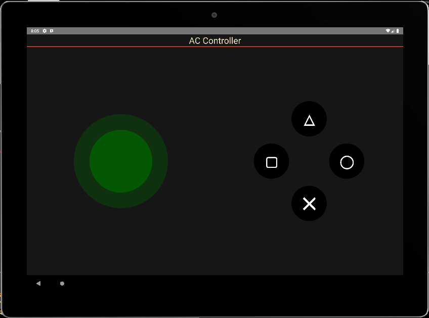
Basic application: 4 buttons
In this code, we’ll have a main view (View) covering the screen, the application title, and the view containing the 4 buttons. The functions executed when the buttons are pressed and the styles defined.
/**
 * https://github.com/jim-at-jibba/react-native-game-pad
 * https://github.com/ionkorol/react-native-joystick
 *
 */
import React from "react";
import { StyleSheet, Text, TouchableOpacity, View } from "react-native";


const GamePad = () =>  {

  let btnAColor = "red",
      btnBColor = "orange",
      btnXColor = "royalblue",
      btnYColor = "limegreen"

  const onButtonAPress = () => {
    console.log('You clicked button A');
  };
  const onButtonBPress = () => {
    console.log('You clicked button B');
  };

  const onButtonXPress = () => {
    console.log('You clicked button X');
  };
  const onButtonYPress = () => {
    console.log('You clicked button Y');
  };


    return (
      <View style={styles.mainBody}>
          <Text
            style={styles.mainTitle}>
            AC Controller
          </Text>
          <View style={{ flex: 1,justifyContent: "center", alignItems: "center",}}>
              <View
                style={{
                  //flex: 1,
                  justifyContent: "center",
                  alignItems: "center",
                  //backgroundColor:"green",
                  zIndex: 100,
                }}
              >
                <TouchableOpacity
                  style={[styles.button, {  top:"30%",backgroundColor: `${btnXColor}` }]} //top:"30%", right:"1%",
                  onPress={() => onButtonXPress()}
                >
                  <Text style={styles.buttonText}>X</Text>
                </TouchableOpacity>
              </View>

              <View
                style={{
                  //flex: 1,
                  justifyContent: "center",
                  alignItems: "center",
                  //backgroundColor:"gold",
                }}
              >
                <TouchableOpacity
                  style={[styles.button, { top: "50%", right:"20%", backgroundColor: `${btnYColor}` }]} //top:"2%", left:"10%",
                  onPress={() => onButtonYPress()}
                >
                  <Text style={styles.buttonText}>Y</Text>
                </TouchableOpacity>
              </View>

              <View
                style={{
                  //flex: 1,
                  justifyContent: "center",
                  alignItems: "center",
                  //backgroundColor:"blue",
                }}
              >
                <TouchableOpacity
                  style={[styles.button, { bottom:"50%", left:"20%", backgroundColor: `${btnAColor}` }]} //bottom:"2%",
                  onPress={() => onButtonAPress()}
                >
                  <Text style={styles.buttonText}>A</Text>
                </TouchableOpacity>
              </View>


            <View
                style={{
                  //flex: 1,
                  justifyContent: "center",
                  alignItems: "center",
                  //backgroundColor:"red",
                }}
              >
                <TouchableOpacity
                  style={[styles.button, { bottom:"30%", backgroundColor: `${btnBColor}` }]} //bottom:"30%", left:"1%",
                  onPress={() => onButtonBPress()}
                >
                  <Text style={styles.buttonText}>B</Text>
                </TouchableOpacity>
              </View>

          </View>
      </View>

    );
}
export default GamePad;

//parameters
let BACKGROUND_COLOR = "#161616"; //191A19
let BUTTON_COLOR = "#346751"; //1E5128
let ERROR_COLOR = "#C84B31"; //4E9F3D
let TEXT_COLOR = "#ECDBBA"; //D8E9A8

const styles = StyleSheet.create({

  mainBody: {
    flex:1,
    justifyContent: 'center',
    alignItems: "center",
    color:TEXT_COLOR,
    backgroundColor: BACKGROUND_COLOR,
  },

  mainTitle:{
    color: TEXT_COLOR,
    fontSize: 30,
    textAlign: 'center',
    borderBottomWidth: 2,
    borderBottomColor: ERROR_COLOR,
    width:"100%"
  },

  button: {
    height: 90,
    width: 90,
    borderRadius: 90 / 2,
    justifyContent: "center",
    alignItems: "center"
  },
  buttonText: {
    fontSize: 22,
    color: "white",
    fontWeight: "700"
  },


});
button presses execute event functions correctly
 BUNDLE  ./index.js

 LOG  Running "CustomApp" with {"rootTag":31}
 LOG  You clicked button Y
 LOG  You clicked button X
 LOG  You clicked button A
 LOG  You clicked button B
Call the component from a source file
We will place this code in a .
To use it, we use the export keyword to define the function
export const ButtonPad = ()  =>  {
...
}
The component can then be used by importing it
import {ButtonPad} from "./src/ACJoysticks";
const GamePad = () =>  {
    return (
      <View style={styles.mainBody}>
          <Text
            style={styles.mainTitle}>
            AC Controller
          </Text>
          <ButtonPad/>
      </View>

    );
};
export default GamePad;
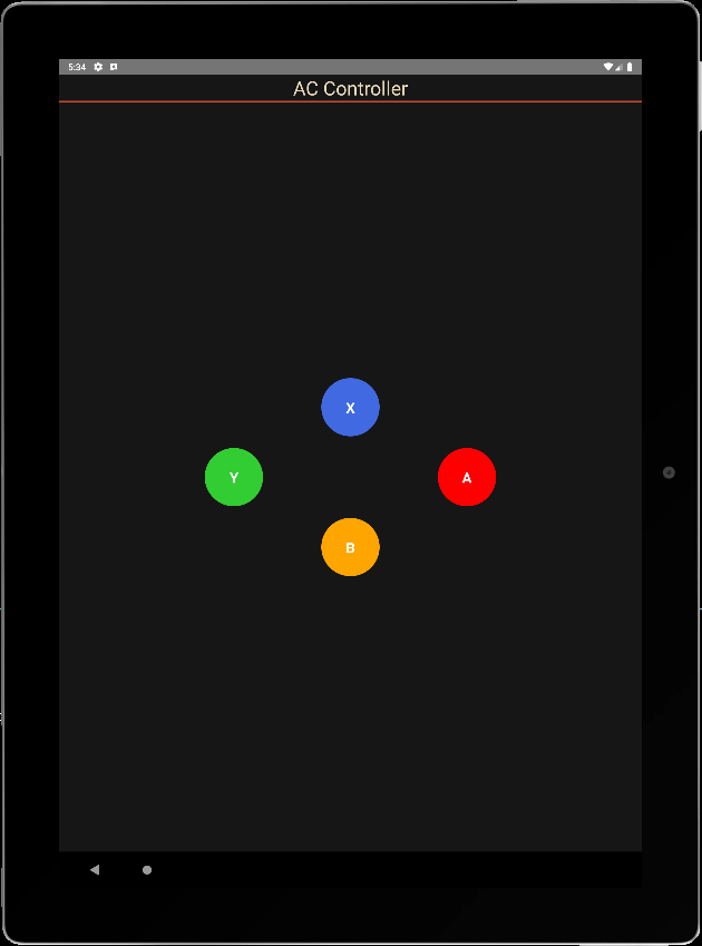
Passing properties to a functional component
To make the component configurable, we define parameters in the main file that will be passed to the component’s properties. The properties we wish to pass to the component are:
- the text displayed on the buttons
- button color
- button size
- the onClick function, which manages all buttons
Component parameters placed in a ButtonPadProps type
type ButtonPadProps = {
  radius?: number;
  names?: string[4];
  colors?: string[4];
  onClick?:(evt: ButtonPadEvent) => void;
};
We can then define these properties as input to the component and call them up with default values.
export const ButtonPad = (props : ButtonPadProps)  =>  {
  const { onClick, radius = 45, names= ['X','Y','A','B'], colors = ["royalblue","limegreen","red","orange"] } = props;
We define a single button call function
  const onButtonPress = (index:number) => {
    console.log('You clicked button ' + names[index]);
  };
Finally, we modify the code to take the various properties into account.
/**
 * ButtonPad
 */

type ButtonPadProps = {
  radius?: number;
  names?: Array<string>;
  colors?: Array<string>;
  onClick?:(evt: ButtonPadEvent) => void;
};

export const ButtonPad = (props : ButtonPadProps)  =>  {
  const { onClick, radius = 45, names= ['X','Y','A','B'], colors = ["royalblue","limegreen","red","orange"] } = props;
  let textSize = radius;

  const onButtonPress = (index:number) => {
    console.log('You clicked button ' + names[index]);
  };


    return (

          <View style={{ flex: 1,justifyContent: "center", alignItems: "center",}}>
              <View
                style={{
                  //flex: 1,
                  justifyContent: "center",
                  alignItems: "center",
                  //backgroundColor:"green",
                  zIndex: 100,
                }}
              >
                <TouchableOpacity
                  style={[{
                    height: 2*radius,
                    width: 2*radius,
                    borderRadius: radius,
                    justifyContent: "center",
                    alignItems: "center"
                  }, {  top:"30%",backgroundColor: `${colors[0]}` }]} //top:"30%", right:"1%",
                  onPress={() => onButtonPress(0)}
                >
                  <Text style={{
                            fontSize: textSize,
                            color: "white",
                            fontWeight: "700"
                          }}>{names[0]}</Text>
                </TouchableOpacity>
              </View>

              <View
                style={{
                  //flex: 1,
                  justifyContent: "center",
                  alignItems: "center",
                  //backgroundColor:"gold",
                }}
              >
                <TouchableOpacity
                  style={[{
                    height: 2*radius,
                    width: 2*radius,
                    borderRadius: radius,
                    justifyContent: "center",
                    alignItems: "center"
                  }, { top: "50%", right:"20%", backgroundColor: `${colors[1]}` }]} //top:"2%", left:"10%",
                  onPress={() => onButtonPress(1)}
                >
                  <Text style={{
                            fontSize: textSize,
                            color: "white",
                            fontWeight: "700"
                          }}>{names[1]}</Text>
                </TouchableOpacity>
              </View>

              <View
                style={{
                  //flex: 1,
                  justifyContent: "center",
                  alignItems: "center",
                  //backgroundColor:"blue",
                }}
              >
                <TouchableOpacity
                  style={[{
                    height: 2*radius,
                    width: 2*radius,
                    borderRadius: radius,
                    justifyContent: "center",
                    alignItems: "center"
                  }, { bottom:"50%", left:"20%", backgroundColor: `${colors[2]}` }]} //bottom:"2%",
                  onPress={() => onButtonPress(2)}
                >
                  <Text style={{
                            fontSize: textSize,
                            color: "white",
                            fontWeight: "700"
                          }}>{names[2]}</Text>
                </TouchableOpacity>
              </View>


            <View
                style={{
                  //flex: 1,
                  justifyContent: "center",
                  alignItems: "center",
                  //backgroundColor:"red",
                }}
              >
                <TouchableOpacity
                  style={[{
                    height: 2*radius,
                    width: 2*radius,
                    borderRadius: radius,
                    justifyContent: "center",
                    alignItems: "center"
                  }, { bottom:"30%", backgroundColor: `${colors[3]}` }]} //bottom:"30%", left:"1%",
                  onPress={() => onButtonPress(3)}
                >
                  <Text style={{
                            fontSize: textSize,
                            color: "white",
                            fontWeight: "700"
                          }}>{names[3]}</Text>
                </TouchableOpacity>
              </View>

          </View>
    );
}
Pass data from component to application
To return data to the main application, we use an interface containing button states and the name of the button pressed
interface ButtonPadEvent {
  states : Array<boolean>;
  pressed: string;
}
We modify the onButtonPress function to feed states and send them to the onClick function.
  const onButtonPress = (index:number) => {

    let btnStates= [false,false,false,false];
    btnStates[index] = true;

    if(typeof(onClick)==="function"){
      onClick({
             states: btnStates,
             pressed: names[index]
         });
       }
  };
N.B.: The notation if(typeof(onClick)===”function”){ onClick() } is equivalent to onClick && onClick()
We can now call our component in the main application, create a listening function and modify its parameters.
const GamePad = () => {
const onPadClick = (data: any) => {
console.log("form ButtonPad: ",data);
}
return (
<View style={styles.mainBody}>
<Text
style={styles.mainTitle}>
AC Controller
</Text>
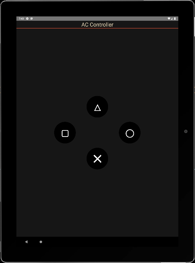
<ButtonPad radius={60} names={['\u2573', '\u25EF', '\u25B3', "\u25A2"]} colors={['black', 'black', 'black', 'black']} onClick={onPadClick} />
</View>
);
}
export default GamePad;
info Reloading app...
 BUNDLE  ./index.js

 LOG  Running "CustomApp" with {"rootTag":81}
 LOG  form ButtonPad:  {"pressed": "╳", "states": [true, false, false, false]}
 LOG  form ButtonPad:  {"pressed": "△", "states": [false, false, true, false]}
 LOG  form ButtonPad:  {"pressed": "▢", "states": [false, false, false, true]}
 LOG  form ButtonPad:  {"pressed": "◯", "states": [false, true, false, false]}
N.B.: to do things properly, you’d need to create onPressIn and onPressOut observers to reset states to zero, and modify the logic to listen to several buttons at once.
Complete code
./src/ACJoysticks.tsx
/**
 * ButtonPad
 */

interface ButtonPadEvent {
  states : Array<boolean>;
  pressed: string;
}

type ButtonPadProps = {
  radius?: number;
  names?: Array<string>;
  colors?: Array<string>;
  onClick?:(evt: ButtonPadEvent) => void;
};


export const ButtonPad = (props : ButtonPadProps)  =>  {
  const { onClick, radius = 45, names= ['X','Y','A','B'], colors = ["royalblue","limegreen","red","orange"] } = props;
  let textSize = radius;
  let btnStates= [false,false,false,false];

  const onButtonPress = (index:number) => {
    btnStates[index] = true;

    if(typeof(onClick)==="function"){
      onClick({
             states: btnStates,
             pressed: names[index]
         });
       }
  };

  const onButtonRel = (index:number) => {
    btnStates[index] = false;

    if(typeof(onClick)==="function"){
      onClick({
             states: btnStates,
             pressed: names[index]
         });
       }
  };

    return (

          <View style={{ flex: 1,justifyContent: "center", alignItems: "center",}}>
              <View
                style={{
                  //flex: 1,
                  justifyContent: "center",
                  alignItems: "center",
                  //backgroundColor:"green",
                  zIndex: 100,
                }}
              >
                <TouchableOpacity
                  style={[{
                    height: 2*radius,
                    width: 2*radius,
                    borderRadius: radius,
                    justifyContent: "center",
                    alignItems: "center"
                  }, {  top:"30%",backgroundColor: `${colors[0]}` }]} //top:"30%", right:"1%",
                  //onPress={() => onButtonPress(0)}
                  onPressIn={() => onButtonPress(0)}
                  onPressOut={() => onButtonRel(0)}
                >
                  <Text style={{
                            fontSize: textSize,
                            color: "white",
                            fontWeight: "700"
                          }}>{names[0]}</Text>
                </TouchableOpacity>
              </View>

              <View
                style={{
                  //flex: 1,
                  justifyContent: "center",
                  alignItems: "center",
                  //backgroundColor:"gold",
                }}
              >
                <TouchableOpacity
                  style={[{
                    height: 2*radius,
                    width: 2*radius,
                    borderRadius: radius,
                    justifyContent: "center",
                    alignItems: "center"
                  }, { top: "50%", right:"20%", backgroundColor: `${colors[1]}` }]} //top:"2%", left:"10%",
                  //onPress={() => onButtonPress(1)}
                  onPressIn={() => onButtonPress(1)}
                  onPressOut={() => onButtonRel(1)}
                >
                  <Text style={{
                            fontSize: textSize,
                            color: "white",
                            fontWeight: "700"
                          }}>{names[1]}</Text>
                </TouchableOpacity>
              </View>

              <View
                style={{
                  //flex: 1,
                  justifyContent: "center",
                  alignItems: "center",
                  //backgroundColor:"blue",
                }}
              >
                <TouchableOpacity
                  style={[{
                    height: 2*radius,
                    width: 2*radius,
                    borderRadius: radius,
                    justifyContent: "center",
                    alignItems: "center"
                  }, { bottom:"50%", left:"20%", backgroundColor: `${colors[2]}` }]} //bottom:"2%",
                  //onPress={() => onButtonPress(2)}
                  onPressIn={() => onButtonPress(2)}
                  onPressOut={() => onButtonRel(2)}
                >
                  <Text style={{
                            fontSize: textSize,
                            color: "white",
                            fontWeight: "700"
                          }}>{names[2]}</Text>
                </TouchableOpacity>
              </View>


            <View
                style={{
                  //flex: 1,
                  justifyContent: "center",
                  alignItems: "center",
                  //backgroundColor:"red",
                }}
              >
                <TouchableOpacity
                  style={[{
                    height: 2*radius,
                    width: 2*radius,
                    borderRadius: radius,
                    justifyContent: "center",
                    alignItems: "center"
                  }, { bottom:"30%", backgroundColor: `${colors[3]}` }]} //bottom:"30%", left:"1%",
                  //onPress={() => onButtonPress(3)}
                  onPressIn={() => onButtonPress(3)}
                  onPressOut={() => onButtonRel(3)}
                >
                  <Text style={{
                            fontSize: textSize,
                            color: "white",
                            fontWeight: "700"
                          }}>{names[3]}</Text>
                </TouchableOpacity>
              </View>

          </View>
    );
}
./App.tsx
import React from "react";
import { StyleSheet, Text, TouchableOpacity, View } from "react-native";
import {ButtonPad} from "./src/ACJoysticks";

const GamePad = () =>  {
  const onPadClick = (data: any) => {
    console.log("from ButtonPad: ",data);
    //data.states[0], data.pressed
  }

    return (
      <View style={styles.mainBody}>
          <Text
            style={styles.mainTitle}>
            AC Controller
          </Text>
          <ButtonPad radius={60} names={[ '\u25B3', '\u25A2', '\u25EF',  '\u2573',]} colors={['black', 'black', 'black', 'black']} onClick={onPadClick} />
      </View>

    );
}
export default GamePad;

//parameters
let BACKGROUND_COLOR = "#161616"; //191A19
let BUTTON_COLOR = "#346751"; //1E5128
let ERROR_COLOR = "#C84B31"; //4E9F3D
let TEXT_COLOR = "#ECDBBA"; //D8E9A8

const styles = StyleSheet.create({

  mainBody: {
    flex:1,
    justifyContent: 'center',
    alignItems: "center",
    color:TEXT_COLOR,
    backgroundColor: BACKGROUND_COLOR,
  },

  mainTitle:{
    color: TEXT_COLOR,
    fontSize: 30,
    textAlign: 'center',
    borderBottomWidth: 2,
    borderBottomColor: ERROR_COLOR,
    width:"100%"
  },
});
Applications
- Create reusable and configurable components for your applications
- Create applications to control your projects via Bluetooth, BLE or Wifi