Une fois votre première application React Native créée et opérationnelle, vous voudrez peut-être réutiliser certains éléments comme composant fonctionnel. Ces composants peuvent alors être configurés pour d’autres applications et être partagés sous forme de librairie.
Description
Dans ce tutoriel, nous allons partir d’une application simple contenant quatre boutons. Nous allons créer un composant fonctionnel React Native configurable dans un fichier source que nous allons réutiliser dans le fichier principal l’application.
Nous allons voir comment:
- passer des propriétés à un composant
- récupérer les données d’un composant à partir d’évènement
- utiliser un composant défini dans un fichier source dans le fichier principal
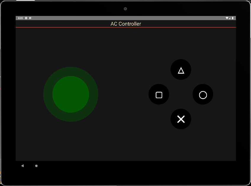
Application de base : 4 boutons
Dans ce code, nous allons avoir une vue principale (View) qui recouvre l’écran, le titre de l’application, et la vue qui va contenir les 4 boutons. Les fonctions exécutés lors des appuis et la définition des styles.
/**
 * https://github.com/jim-at-jibba/react-native-game-pad
 * https://github.com/ionkorol/react-native-joystick
 *
 */
import React from "react";
import { StyleSheet, Text, TouchableOpacity, View } from "react-native";


const GamePad = () =>  {

  let btnAColor = "red",
      btnBColor = "orange",
      btnXColor = "royalblue",
      btnYColor = "limegreen"

  const onButtonAPress = () => {
    console.log('You clicked button A');
  };
  const onButtonBPress = () => {
    console.log('You clicked button B');
  };

  const onButtonXPress = () => {
    console.log('You clicked button X');
  };
  const onButtonYPress = () => {
    console.log('You clicked button Y');
  };


    return (
      <View style={styles.mainBody}>
          <Text
            style={styles.mainTitle}>
            AC Controller
          </Text>
          <View style={{ flex: 1,justifyContent: "center", alignItems: "center",}}>
              <View
                style={{
                  //flex: 1,
                  justifyContent: "center",
                  alignItems: "center",
                  //backgroundColor:"green",
                  zIndex: 100,
                }}
              >
                <TouchableOpacity
                  style={[styles.button, {  top:"30%",backgroundColor: `${btnXColor}` }]} //top:"30%", right:"1%",
                  onPress={() => onButtonXPress()}
                >
                  <Text style={styles.buttonText}>X</Text>
                </TouchableOpacity>
              </View>

              <View
                style={{
                  //flex: 1,
                  justifyContent: "center",
                  alignItems: "center",
                  //backgroundColor:"gold",
                }}
              >
                <TouchableOpacity
                  style={[styles.button, { top: "50%", right:"20%", backgroundColor: `${btnYColor}` }]} //top:"2%", left:"10%",
                  onPress={() => onButtonYPress()}
                >
                  <Text style={styles.buttonText}>Y</Text>
                </TouchableOpacity>
              </View>

              <View
                style={{
                  //flex: 1,
                  justifyContent: "center",
                  alignItems: "center",
                  //backgroundColor:"blue",
                }}
              >
                <TouchableOpacity
                  style={[styles.button, { bottom:"50%", left:"20%", backgroundColor: `${btnAColor}` }]} //bottom:"2%",
                  onPress={() => onButtonAPress()}
                >
                  <Text style={styles.buttonText}>A</Text>
                </TouchableOpacity>
              </View>


            <View
                style={{
                  //flex: 1,
                  justifyContent: "center",
                  alignItems: "center",
                  //backgroundColor:"red",
                }}
              >
                <TouchableOpacity
                  style={[styles.button, { bottom:"30%", backgroundColor: `${btnBColor}` }]} //bottom:"30%", left:"1%",
                  onPress={() => onButtonBPress()}
                >
                  <Text style={styles.buttonText}>B</Text>
                </TouchableOpacity>
              </View>

          </View>
      </View>

    );
}
export default GamePad;

//parameters
let BACKGROUND_COLOR = "#161616"; //191A19
let BUTTON_COLOR = "#346751"; //1E5128
let ERROR_COLOR = "#C84B31"; //4E9F3D
let TEXT_COLOR = "#ECDBBA"; //D8E9A8

const styles = StyleSheet.create({

  mainBody: {
    flex:1,
    justifyContent: 'center',
    alignItems: "center",
    color:TEXT_COLOR,
    backgroundColor: BACKGROUND_COLOR,
  },

  mainTitle:{
    color: TEXT_COLOR,
    fontSize: 30,
    textAlign: 'center',
    borderBottomWidth: 2,
    borderBottomColor: ERROR_COLOR,
    width:"100%"
  },

  button: {
    height: 90,
    width: 90,
    borderRadius: 90 / 2,
    justifyContent: "center",
    alignItems: "center"
  },
  buttonText: {
    fontSize: 22,
    color: "white",
    fontWeight: "700"
  },


});
l’appui sur les boutons exécute bien les fonctions évènements
 BUNDLE  ./index.js

 LOG  Running "CustomApp" with {"rootTag":31}
 LOG  You clicked button Y
 LOG  You clicked button X
 LOG  You clicked button A
 LOG  You clicked button B
Appeler le composant à partir d’un fichier source
Nous allons placer ce code dans un fichier ./src/ACJoysticks.tsx et nous changeons le nom du composant en ButtonPad
Pour pouvoir l’utiliser, nous utilisons le mot-clé export pour définir la fonction
export const ButtonPad = ()  =>  {
...
}
Il est ensuite possible d’utiliser le composant en l’important
import {ButtonPad} from "./src/ACJoysticks";
const GamePad = () =>  {
    return (
      <View style={styles.mainBody}>
          <Text
            style={styles.mainTitle}>
            AC Controller
          </Text>
          <ButtonPad/>
      </View>

    );
};
export default GamePad;
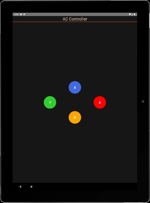
Passer des propriétés à un composant fonctionnel
Pour rendre le composant configurable, nous définissons des paramètres dans le fichier principale qui seront passés dans les propriétés du composant. Les propriétés que nous souhaitons passer au composant sont:
- le texte affiché sur les boutons
- la couleur des boutons
- la taille des boutons
- la fonction onClick qui gère tous les boutons
Les paramètres du composant son placés dans un type ButtonPadProps
type ButtonPadProps = {
  radius?: number;
  names?: string[4];
  colors?: string[4];
  onClick?:(evt: ButtonPadEvent) => void;
};
Nous pouvons ensuite définir ces propriétés en entrée du composant et les appelés avec des valeurs par défaut.
export const ButtonPad = (props : ButtonPadProps)  =>  {
  const { onClick, radius = 45, names= ['X','Y','A','B'], colors = ["royalblue","limegreen","red","orange"] } = props;
Nous définissons une fonction unique d’appel des boutons
  const onButtonPress = (index:number) => {
    console.log('You clicked button ' + names[index]);
  };
Enfin, nous modifions le code pour prendre en compte les différentes propriétés.
/**
 * ButtonPad
 */

type ButtonPadProps = {
  radius?: number;
  names?: Array<string>;
  colors?: Array<string>;
  onClick?:(evt: ButtonPadEvent) => void;
};

export const ButtonPad = (props : ButtonPadProps)  =>  {
  const { onClick, radius = 45, names= ['X','Y','A','B'], colors = ["royalblue","limegreen","red","orange"] } = props;
  let textSize = radius;

  const onButtonPress = (index:number) => {
    console.log('You clicked button ' + names[index]);
  };


    return (

          <View style={{ flex: 1,justifyContent: "center", alignItems: "center",}}>
              <View
                style={{
                  //flex: 1,
                  justifyContent: "center",
                  alignItems: "center",
                  //backgroundColor:"green",
                  zIndex: 100,
                }}
              >
                <TouchableOpacity
                  style={[{
                    height: 2*radius,
                    width: 2*radius,
                    borderRadius: radius,
                    justifyContent: "center",
                    alignItems: "center"
                  }, {  top:"30%",backgroundColor: `${colors[0]}` }]} //top:"30%", right:"1%",
                  onPress={() => onButtonPress(0)}
                >
                  <Text style={{
                            fontSize: textSize,
                            color: "white",
                            fontWeight: "700"
                          }}>{names[0]}</Text>
                </TouchableOpacity>
              </View>

              <View
                style={{
                  //flex: 1,
                  justifyContent: "center",
                  alignItems: "center",
                  //backgroundColor:"gold",
                }}
              >
                <TouchableOpacity
                  style={[{
                    height: 2*radius,
                    width: 2*radius,
                    borderRadius: radius,
                    justifyContent: "center",
                    alignItems: "center"
                  }, { top: "50%", right:"20%", backgroundColor: `${colors[1]}` }]} //top:"2%", left:"10%",
                  onPress={() => onButtonPress(1)}
                >
                  <Text style={{
                            fontSize: textSize,
                            color: "white",
                            fontWeight: "700"
                          }}>{names[1]}</Text>
                </TouchableOpacity>
              </View>

              <View
                style={{
                  //flex: 1,
                  justifyContent: "center",
                  alignItems: "center",
                  //backgroundColor:"blue",
                }}
              >
                <TouchableOpacity
                  style={[{
                    height: 2*radius,
                    width: 2*radius,
                    borderRadius: radius,
                    justifyContent: "center",
                    alignItems: "center"
                  }, { bottom:"50%", left:"20%", backgroundColor: `${colors[2]}` }]} //bottom:"2%",
                  onPress={() => onButtonPress(2)}
                >
                  <Text style={{
                            fontSize: textSize,
                            color: "white",
                            fontWeight: "700"
                          }}>{names[2]}</Text>
                </TouchableOpacity>
              </View>


            <View
                style={{
                  //flex: 1,
                  justifyContent: "center",
                  alignItems: "center",
                  //backgroundColor:"red",
                }}
              >
                <TouchableOpacity
                  style={[{
                    height: 2*radius,
                    width: 2*radius,
                    borderRadius: radius,
                    justifyContent: "center",
                    alignItems: "center"
                  }, { bottom:"30%", backgroundColor: `${colors[3]}` }]} //bottom:"30%", left:"1%",
                  onPress={() => onButtonPress(3)}
                >
                  <Text style={{
                            fontSize: textSize,
                            color: "white",
                            fontWeight: "700"
                          }}>{names[3]}</Text>
                </TouchableOpacity>
              </View>

          </View>
    );
}
Passer des données du composant vers l’application
Pour retourner des données vers l’application principale, nous utilisons une interface contenant les états des boutons et le nom du bouton pressé
interface ButtonPadEvent {
  states : Array<boolean>;
  pressed: string;
}
Nous modifions la fonction onButtonPress pour alimenter les états et les envoyer à la fonction onClick
  const onButtonPress = (index:number) => {

    let btnStates= [false,false,false,false];
    btnStates[index] = true;

    if(typeof(onClick)==="function"){
      onClick({
             states: btnStates,
             pressed: names[index]
         });
       }
  };
N.B.: La notation if(typeof(onClick)=== »function »){ onClick() } est équivalente à onClick && onClick()
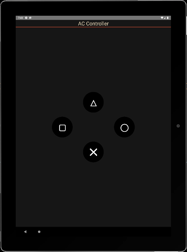
Nous pouvons maintenant appelé notre composant dans l’application principale, créer une fonction d’écoute et modifier ses paramètres.
const GamePad = () =>  {
  const onPadClick = (data: any) => {
    console.log("form ButtonPad: ",data);
  }
    return (
      <View style={styles.mainBody}>
          <Text
            style={styles.mainTitle}>
            AC Controller
          </Text>
          <ButtonPad radius={60} names={['\u2573', '\u25EF', '\u25B3', "\u25A2"]} colors={['black', 'black', 'black', 'black']} onClick={onPadClick} />
      </View>

    );
}
export default GamePad;
info Reloading app...
 BUNDLE  ./index.js

 LOG  Running "CustomApp" with {"rootTag":81}
 LOG  form ButtonPad:  {"pressed": "╳", "states": [true, false, false, false]}
 LOG  form ButtonPad:  {"pressed": "△", "states": [false, false, true, false]}
 LOG  form ButtonPad:  {"pressed": "▢", "states": [false, false, false, true]}
 LOG  form ButtonPad:  {"pressed": "◯", "states": [false, true, false, false]}
N.B.: pour faire les choses bien il faudrait créer les observateurs onPressIn et onPressOut pour repasser les états à zéro et modifier la logique pour écouter plusieurs bouton à la fois.
Code complet
./src/ACJoysticks.tsx
/**
 * ButtonPad
 */

interface ButtonPadEvent {
  states : Array<boolean>;
  pressed: string;
}

type ButtonPadProps = {
  radius?: number;
  names?: Array<string>;
  colors?: Array<string>;
  onClick?:(evt: ButtonPadEvent) => void;
};


export const ButtonPad = (props : ButtonPadProps)  =>  {
  const { onClick, radius = 45, names= ['X','Y','A','B'], colors = ["royalblue","limegreen","red","orange"] } = props;
  let textSize = radius;
  let btnStates= [false,false,false,false];

  const onButtonPress = (index:number) => {
    btnStates[index] = true;

    if(typeof(onClick)==="function"){
      onClick({
             states: btnStates,
             pressed: names[index]
         });
       }
  };

  const onButtonRel = (index:number) => {
    btnStates[index] = false;

    if(typeof(onClick)==="function"){
      onClick({
             states: btnStates,
             pressed: names[index]
         });
       }
  };

    return (

          <View style={{ flex: 1,justifyContent: "center", alignItems: "center",}}>
              <View
                style={{
                  //flex: 1,
                  justifyContent: "center",
                  alignItems: "center",
                  //backgroundColor:"green",
                  zIndex: 100,
                }}
              >
                <TouchableOpacity
                  style={[{
                    height: 2*radius,
                    width: 2*radius,
                    borderRadius: radius,
                    justifyContent: "center",
                    alignItems: "center"
                  }, {  top:"30%",backgroundColor: `${colors[0]}` }]} //top:"30%", right:"1%",
                  //onPress={() => onButtonPress(0)}
                  onPressIn={() => onButtonPress(0)}
                  onPressOut={() => onButtonRel(0)}
                >
                  <Text style={{
                            fontSize: textSize,
                            color: "white",
                            fontWeight: "700"
                          }}>{names[0]}</Text>
                </TouchableOpacity>
              </View>

              <View
                style={{
                  //flex: 1,
                  justifyContent: "center",
                  alignItems: "center",
                  //backgroundColor:"gold",
                }}
              >
                <TouchableOpacity
                  style={[{
                    height: 2*radius,
                    width: 2*radius,
                    borderRadius: radius,
                    justifyContent: "center",
                    alignItems: "center"
                  }, { top: "50%", right:"20%", backgroundColor: `${colors[1]}` }]} //top:"2%", left:"10%",
                  //onPress={() => onButtonPress(1)}
                  onPressIn={() => onButtonPress(1)}
                  onPressOut={() => onButtonRel(1)}
                >
                  <Text style={{
                            fontSize: textSize,
                            color: "white",
                            fontWeight: "700"
                          }}>{names[1]}</Text>
                </TouchableOpacity>
              </View>

              <View
                style={{
                  //flex: 1,
                  justifyContent: "center",
                  alignItems: "center",
                  //backgroundColor:"blue",
                }}
              >
                <TouchableOpacity
                  style={[{
                    height: 2*radius,
                    width: 2*radius,
                    borderRadius: radius,
                    justifyContent: "center",
                    alignItems: "center"
                  }, { bottom:"50%", left:"20%", backgroundColor: `${colors[2]}` }]} //bottom:"2%",
                  //onPress={() => onButtonPress(2)}
                  onPressIn={() => onButtonPress(2)}
                  onPressOut={() => onButtonRel(2)}
                >
                  <Text style={{
                            fontSize: textSize,
                            color: "white",
                            fontWeight: "700"
                          }}>{names[2]}</Text>
                </TouchableOpacity>
              </View>


            <View
                style={{
                  //flex: 1,
                  justifyContent: "center",
                  alignItems: "center",
                  //backgroundColor:"red",
                }}
              >
                <TouchableOpacity
                  style={[{
                    height: 2*radius,
                    width: 2*radius,
                    borderRadius: radius,
                    justifyContent: "center",
                    alignItems: "center"
                  }, { bottom:"30%", backgroundColor: `${colors[3]}` }]} //bottom:"30%", left:"1%",
                  //onPress={() => onButtonPress(3)}
                  onPressIn={() => onButtonPress(3)}
                  onPressOut={() => onButtonRel(3)}
                >
                  <Text style={{
                            fontSize: textSize,
                            color: "white",
                            fontWeight: "700"
                          }}>{names[3]}</Text>
                </TouchableOpacity>
              </View>

          </View>
    );
}
./App.tsx
import React from "react";
import { StyleSheet, Text, TouchableOpacity, View } from "react-native";
import {ButtonPad} from "./src/ACJoysticks";

const GamePad = () =>  {
  const onPadClick = (data: any) => {
    console.log("from ButtonPad: ",data);
    //data.states[0], data.pressed
  }

    return (
      <View style={styles.mainBody}>
          <Text
            style={styles.mainTitle}>
            AC Controller
          </Text>
          <ButtonPad radius={60} names={[ '\u25B3', '\u25A2', '\u25EF',  '\u2573',]} colors={['black', 'black', 'black', 'black']} onClick={onPadClick} />
      </View>

    );
}
export default GamePad;

//parameters
let BACKGROUND_COLOR = "#161616"; //191A19
let BUTTON_COLOR = "#346751"; //1E5128
let ERROR_COLOR = "#C84B31"; //4E9F3D
let TEXT_COLOR = "#ECDBBA"; //D8E9A8

const styles = StyleSheet.create({

  mainBody: {
    flex:1,
    justifyContent: 'center',
    alignItems: "center",
    color:TEXT_COLOR,
    backgroundColor: BACKGROUND_COLOR,
  },

  mainTitle:{
    color: TEXT_COLOR,
    fontSize: 30,
    textAlign: 'center',
    borderBottomWidth: 2,
    borderBottomColor: ERROR_COLOR,
    width:"100%"
  },
});
Applications
- Créer des composants réutilisables et configurables pour vos applications
- Créer des applications pour piloter vos projets en Bluetooth, BLE ou Wifi