It’s possible to plot curves in real time on a web app using Chart.js. When you create a web app, you’re bound to want to display data. The Chart.js library integrates with your html files and JavaScript scripts to plot data from sensors, files or databases.
To test the library, you can create a web app using Flask.
Implementing Chart.js
To use the Chart.js library in your html file, simply call the script at the following url
<script src="https://cdn.jsdelivr.net/npm/chart.js"></script>
Chart.js is a Javascript library for drawing interactive curves on an HTML page. Implementation is similar for all curves.
- Define a canvas element in the body of your page with an identifier (e.g. myChart)
<body>
	<div width="60%">
		<h1>Chart.js</h1>
		<canvas id="myChart"></canvas>
	</div>
</body>
- Create a script to retrieve this element
<script>
  const ctx = document.getElementById('myChart');
</script>
- Finally, in the same script, edit a function that will specify the curve to be drawn
The schematic type is defined by “type: ‘bar'”, the names displayed on the axis are defined in the data.labels structure (here, apple, banana, etc.) and finally the ordinates are defined in the data.datasets.data structure (here, 12, 19, etc.).
 new Chart(ctx, {
    type: 'bar',
    data: {
      labels: ['Apple', 'Banana', 'Orange', 'Ananas', 'Kiwi', 'Pear'],
      datasets: [{
        label: '# of Fruits',
        data: [12, 19, 3, 5, 2, 3],
        borderWidth: 1
      }]
    },
    options: {
      scales: {
        y: {
          beginAtZero: true
        }
      }
    }
  });
There are a number of charts you can play with. To use them, simply replace the “type” variable in the Chart function.
bar’, ‘line’, ‘doughnut’, ‘pie’, ‘polarArea’, ‘radar’, ‘bubble’, ‘scatter’.
N.B.: bubble and scatter use numerical data and additional information.
Drawing a histogram
Here’s a complete example of how to plot a histogram,
<!DOCTYPE html>
<html>
<meta charset="UTF-8">

<script src="https://cdn.jsdelivr.net/npm/chart.js"></script>

<head>
	<title>HelloWorld</title>
	<link rel="stylesheet" href='../static/style.css'/>
</head>

<body>
	<div width="60%">
		<h1>Chart.js</h1>
		<canvas id="myChart"></canvas>
	</div>
</body>

<script>
	Chart.defaults.backgroundColor = '#9BD0F5';
	Chart.defaults.borderColor = '#555555';
	Chart.defaults.color = '#FFFFFF';

  const ctx = document.getElementById('myChart');

  new Chart(ctx, {
    type: 'bar',
    data: {
      labels: ['Apple', 'Banana', 'Orange', 'Ananas', 'Kiwi', 'Pear'],
      datasets: [{
        label: '# of Fruits',
        data: [12, 19, 3, 5, 2, 3],
        borderWidth: 1
      }]
    },
    options: {
      scales: {
        y: {
          beginAtZero: true
        }
      }
    }
  });

</script>
</html>

Draw a line
<body>
<div width="60%">
<canvas id="myLine"></canvas>
</div>
</body>
<script>
Chart.defaults.backgroundColor = '#9BD0F5';
Chart.defaults.borderColor = '#555555';
Chart.defaults.color = '#FFFFFF';
const cvs = document.getElementById('myLine');
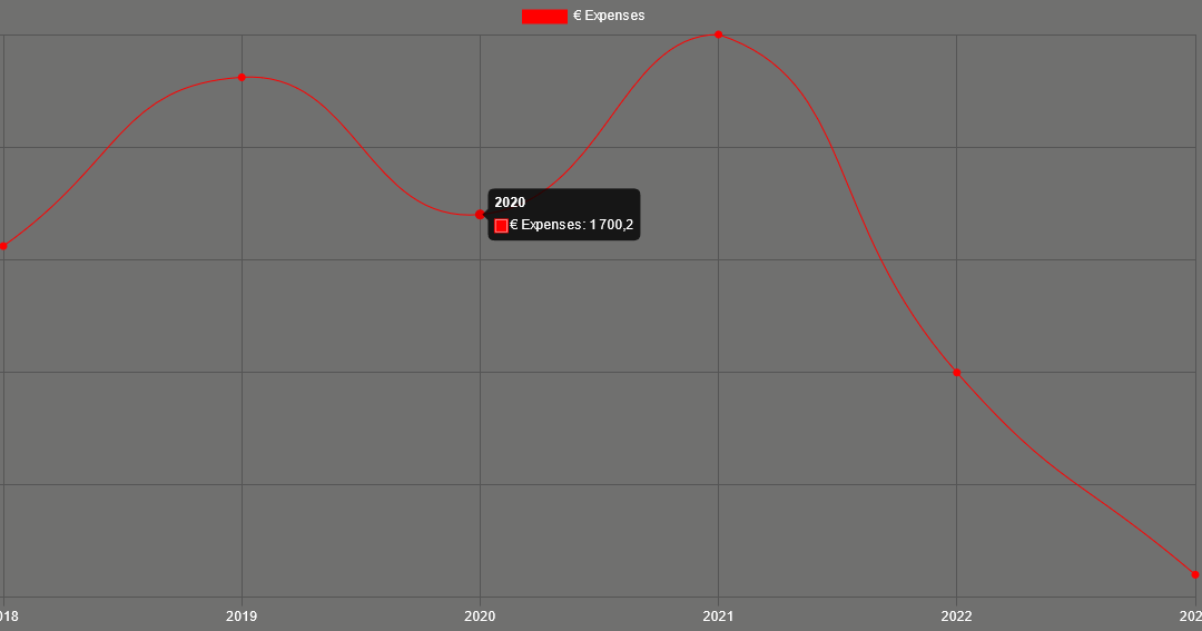
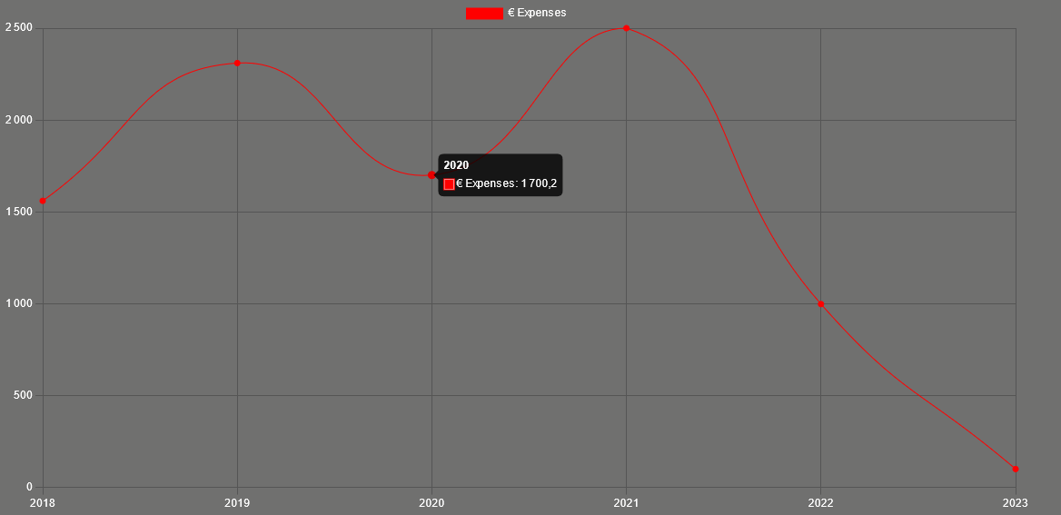
const labels = [2018,2019,2020,2021,2022,2023]
const datas=[1560, 2310, 1700.20, 2500, 998, 100];
new Chart(cvs, {
type: 'line', //
data: {
labels: labels,
datasets: [{
label: '€ Expenses',
data: datas,
borderWidth: 1,
fill: false,
borderColor: 'rgb(255, 0, 0)',
backgroundColor: 'rgb(255, 0, 0)',
tension: 0.5
}]
},
options: {
scales: {
y: {
beginAtZero: true
}
}
}
});
</script>
With these examples, you can do quite a lot to display beautiful graphics on your web pages. I’m now going to show you two advanced functions you may find useful:
- plot from csv file
- perform actions when you click on a part of the graph
Bonus: plot curves from a CSV file
To import a cs file, we use the d3 library
<script src="https://d3js.org/d3.v7.min.js"></script>
This library will enable us to import the values contained in the inventory.csv file in the form of a table, with the column names in the first line.
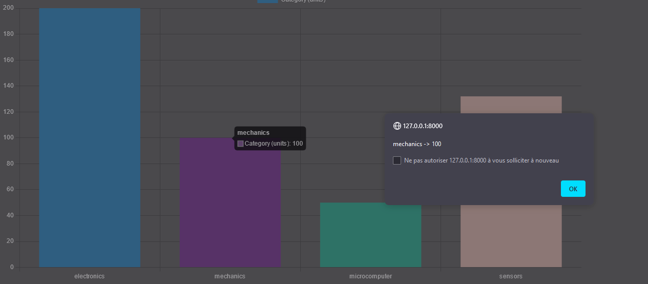
"category";"value"
"electronics";"200"
"mechanics";"100"
"microcomputer";"50"
"sensors";"132"
Then, in the makeChart function, we can call variables using data.map (category or value)
      var category = data.map(function(d) {return d.category;});
      var value = data.map(function(d) {return d.value;});
<script>
// CSV chart
d3.csv("./inventory.csv").then(makeChart);

 function makeChart(data) {
      var category = data.map(function(d) {return d.category;});
      var value = data.map(function(d) {return d.value;});
	var canvas=new Chart(document.getElementById("myCanvas"), {
          type: 'bar', //'line', //'bar', //
          data: {
            labels: category,
            datasets: [
              {
                label: "Category (units)",
                backgroundColor: ["#3e95cd", "#8e5ea2","#3cba9f","#e8c3b9","#c45850"],
                data: value
              }
            ]
          },
          options: {
			responsive: true,
			scaleFontColor: "#FFFFFF",
            legend: { display: false },
            title: {
              display: true,
              text: 'Inventory 2023'
            }
          }
      });
}
</script>
Bonus: Perform an action on a click event
To be able to execute a function when a part of the chart is clicked, we need to define a listen function. These functions already exist in Chart.js. We just need to know where to modify them.
In the options, we’ll modify the function to be executed when the graph is clicked.
          options: {
		events: ['mousemove', 'click'], //select event handled
		onClick: (e) => {
            const canvasPosition = Chart.helpers.getRelativePosition(e, canvas);

            // Substitute the appropriate scale IDs
            const dataX = canvas.scales.x.getValueForPixel(canvasPosition.x);
            const dataY =canvas.scales.y.getValueForPixel(canvasPosition.y);
            console.log(canvas.data.labels[dataX],' -> ',canvas.data.datasets[0].data[dataX]);
            alert(canvas.data.labels[dataX] +' -> '+ canvas.data.datasets[0].data[dataX])
        },
In this example, we’ll retrieve the label and value of the selected zone and display them in an alert window.
<script>
// Bar chart
d3.csv("./static/file/inventory.csv").then(makeChart);

 function makeChart(data) {
      var category = data.map(function(d) {return d.category;});
      var value = data.map(function(d) {return d.value;});
	var canvas=new Chart(document.getElementById("myCanvas"), {
          type: 'bar', //'line', //'bar', //
          data: {
            labels: category,
            datasets: [
              {
                label: "Category (units)",
                backgroundColor: ["#3e95cd", "#8e5ea2","#3cba9f","#e8c3b9","#c45850"],
                data: value
              }
            ]
          },
          options: {
		events: ['mousemove', 'click'], //select event handled
		onClick: (e) => {
            const canvasPosition = Chart.helpers.getRelativePosition(e, canvas);

            // Substitute the appropriate scale IDs
            const dataX = canvas.scales.x.getValueForPixel(canvasPosition.x);
            const dataY =canvas.scales.y.getValueForPixel(canvasPosition.y);
            console.log(canvas.data.labels[dataX],' -> ',canvas.data.datasets[0].data[dataX]);
            alert(canvas.data.labels[dataX] +' -> '+ canvas.data.datasets[0].data[dataX])
        },

			responsive: true,
			scaleFontColor: "#FFFFFF",
            legend: { display: false },
            title: {
              display: true,
              text: 'Inventory 2023'
            }
          }
      });
}
</script>