The Matplotlib Python package is a powerful tool for creating graphs and analyzing data in graphical form. In this tutorial, we’ll look at how to use this library and some of the features you’ll need to know about.
Installing Matplotlib
The Matplotlib library installs like any other Python package
python -m pip install matplotlib
To manipulate data, you can use Numpy and Panda
python -m pip install numpy pandas
Retrieving data to be tracked
It is possible to retrieve data from CSV files with Pandas
| time | myData |
| 0 | 32.0 |
| 1 | 46.2 |
| 2 | 2490 |
| … | … |
| 10 | -2,45 |
import pandas as pd
df = pd.read_csv(filename,sep=";",encoding = "ISO-8859-1",header=1)
mydata = df["myData"]
It is also possible to process the data created by your program with Numpy
import numpy as np

ylist=[]
x = np.linspace(0, 10, 1000)

for i in range(8):
    y = np.random.randn(1)*np.sin((i+1)*np.random.randn(1)*x) # + 0.8 * np.random.randn(50)
    ylist.append(y)
We will use this last method to draw curves
Drawing a simple figure
To plot a curve, first create a window (figure), then a curve (plot).
import matplotlib.pyplot as plt
import numpy as np
import pandas as pd

#plt.close('all') #close all figure

#process data
ylist=[]
x = np.linspace(0, 10, 1000)

for i in range(8):
    y = np.random.randn(1)*np.sin((i+1)*np.random.randn(1)*x)
    ylist.append(y)

#single plot
fig = plt.figure()
plt.plot(x, y) # plot(y)

#mutliple plots
fig = plt.figure()
for y in ylist:
    plt.plot(x, y)
The plot is displayed on the active figure. To make a figure active, you can give them names or numbers, or remember the order in which they are created.
fig1 = plt.figure(1)
fig2 = plt.figure(2)
fig3 = plt.figure("myData")
# use fig2
plt.figure(1) # make fig1 active
#use fig1
Close figures
Once you’ve done what you want with the figure, you can close it with the plt.close() command.
plt.close() #close active figure
plt.close(1) # plot first created figure or figure 1
plt.close("myData") #plot figure named myData
plt.close('all') # close all figures
N.B.: plt.close(‘all’) can be placed at the start of a program to close all previously opened windows at program runtime.
Saving a figure in image format
Each traced image can be saved using the Save icon in the window. You can also ask pyplot to save the figure in PNG or JPG format.
plt.savefig("myImg.jpg",bbox_inches='tight') #png no label
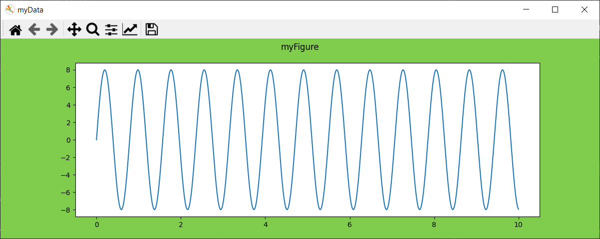
Customize the figure
We have seen that we can give the figure an identifier (plt.figure(“myData”). Other parameters can be defined, in particular
- figsize window size
- facecolor background color
- specify a title suptitle
pyplot.figure(num=None, figsize=None, dpi=None, *, facecolor=None, edgecolor=None, frameon=True, FigureClass=<class 'matplotlib.figure.Figure'>, clear=False, **kwargs)#customize figure
fig = plt.figure("myData",figsize=(12,4),facecolor=(0.5, 0.8, 0.3))
fig.suptitle("myFigure")
plt.plot(x, y)
Customize graphic
To complete the customization of the figure, we can customize the graphic
- graph title
- axis labels
- the legend and its position
- axis extremums
#customize plot
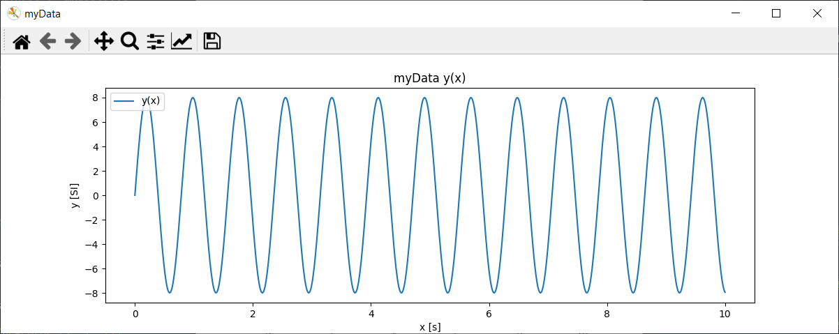
fig = plt.figure("myData",figsize=(12,4),facecolor=(1, 1, 1))
plt.title("myData y(x)")
plt.plot(x, y, label="y(x)")
plt.axis([min(x)-1, max(x)+1, min(y)*1.05, max(y)*1.05]);
plt.xlabel("x [s]")
plt.ylabel("y [SI]")
plt.legend(loc='upper left')
Customize curve
As we’ve seen, when drawing multiple curves, Matplotlib selects different styles for each curve. Curves can be customized in specific ways.
- linestyle (ls) line style
- line color color
- linewidth linewidth (lw)
- marker style marker
- markerfacecolor (mfc) markeredgecolor (mec)
- marker size markersize (ms)
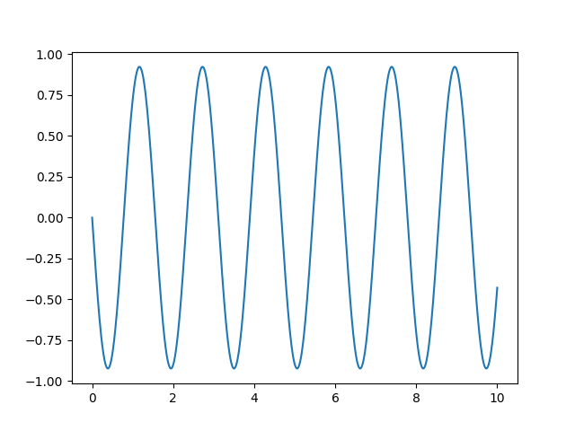
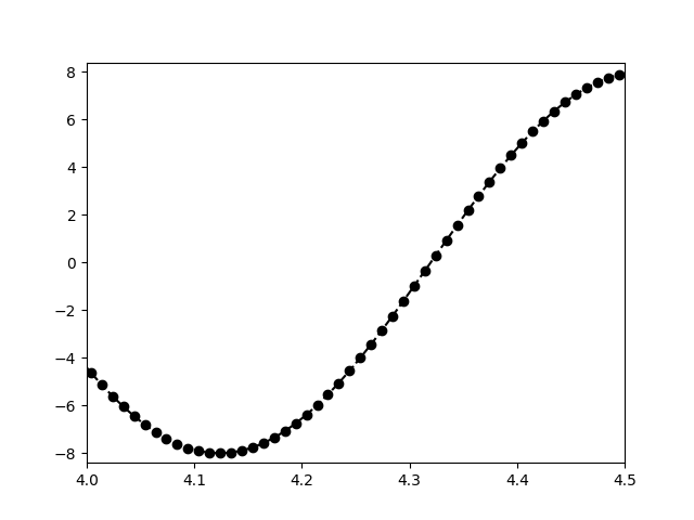
## customize curve
fig = plt.figure()
plt.plot(x, y, "ko--")
plt.axis([4, 4.5, min(y)*1.05, max(y)*1.05]);
#plt.plot(x, y, color="k", linestyle="--", linewidth=1, marker= "o") #equivalent
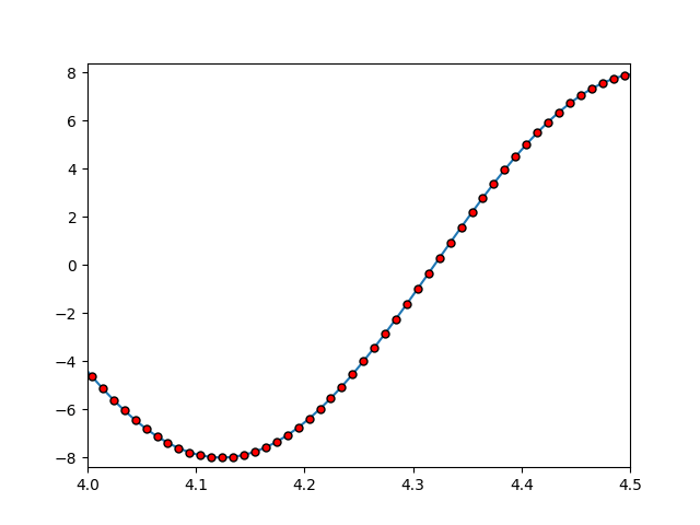
#customize marker
fig = plt.figure()
plt.plot(x, y, marker = 'o', ms = 5, mfc = 'r', mec = 'k')
plt.axis([4, 4.5, min(y)*1.05, max(y)*1.05]);
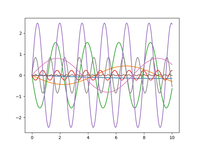
Create a function to draw curves
As there are a large number of parameters to be defined for plotting with Matplotlib, I strongly advise you to create a plotting function that will simplify your life and that you can adapt as needed.
# -*- coding: utf-8 -*-
import matplotlib.pyplot as plt
import numpy as np
plt.close("all")
ylist=[]
ylbl = []
x = np.linspace(0, 10, 1000)
for i in range(8):
y = np.random.choice([-1,1])*(i+1)*np.sin((i+1)*x)
ylist.append(y)
ylbl.append('y{}(x)'.format(i))
##styles options
lstyles= ['-', '--', '-.', ':', 'None', ' ', '', 'solid', 'dashed', 'dashdot', 'dotted']
markers = [None,'o','*','.',',','x','X','+','P','s','D','d','p','H','h','v','^','<','>','1','2','3','4','|','_']
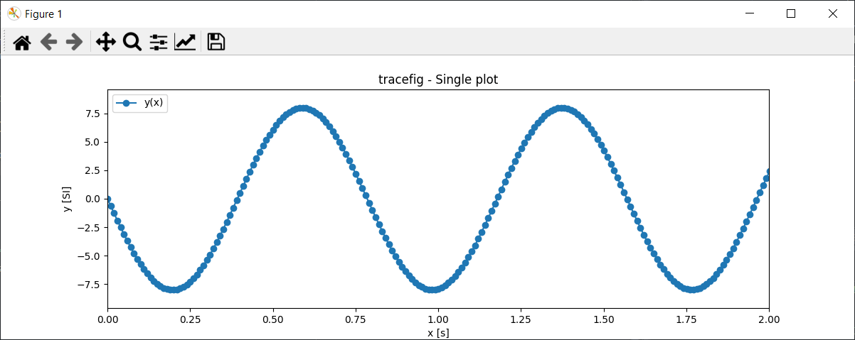
def tracefig(x,y,lbl,ls=None,mrkr=None,title=None,xlbl=None,ylbl=None,size=(12,4),zoomx=None,gridon=False):
fig = plt.figure(figsize=size,facecolor=(1, 1, 1))
if title is not None:
title = "tracefig - {}".format(title)
plt.title(title)
if type(y) is not list:
if ls is None:
ls=np.random.choice(lstyles)
if mrkr is None:
mrkr=np.random.choice(markers)
plt.plot(x, y, linestyle=ls, marker = mrkr, label=lbl)
else:
for i,y in enumerate(ylist):
if ls is None:
ls=np.random.choice(lstyles)
if mrkr is None:
mrkr=np.random.choice(markers)
plt.plot(x, y, linestyle=ls, marker = mrkr, label=lbl[i])
plt.xlabel(xlbl)
plt.ylabel(ylbl)
plt.legend(loc='upper left')
if zoomx is None:
plt.axis([min(x), max(x), np.min(ylist)*1.2, np.max(ylist)*1.2]);
else:
plt.axis([zoomx[0], zoomx[1], np.min(ylist)*1.2, np.max(ylist)*1.2]);
if gridon:
plt.grid() #diplay grid
return fig
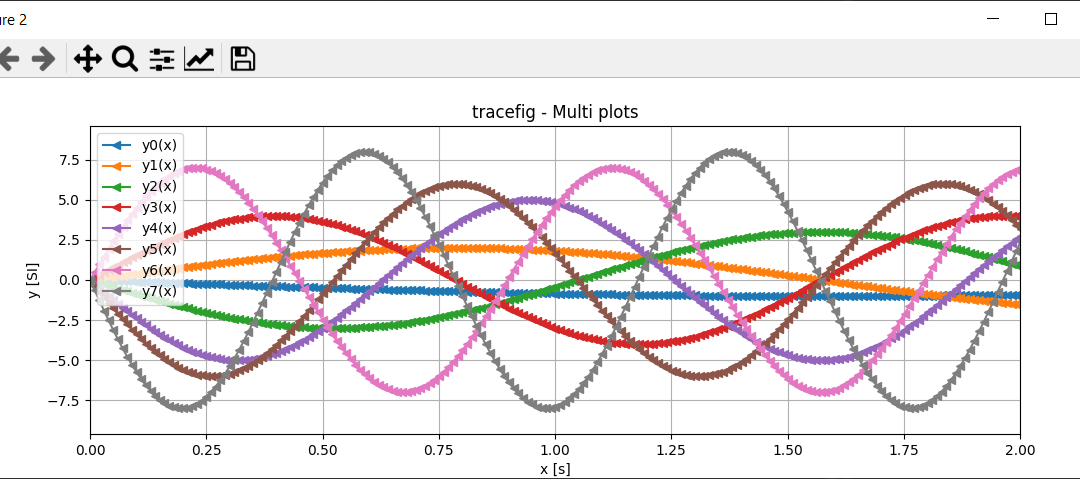
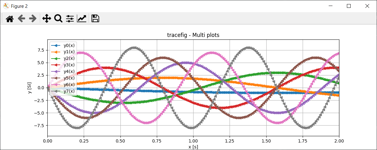
fig = tracefig(x,y,"y(x)",ls="-",mrkr="o",title="Single plot",xlbl="x [s]",ylbl="y [SI]",size=(12,4),zoomx=[0,2])
fig = tracefig(x,ylist,ylbl,ls="-",mrkr=None,title="Multi plots",xlbl="x [s]",ylbl="y [SI]",size=(12,4),zoomx=[0,2], gridon=True)
With this knowledge, you can plot and analyze all types of curves using Matplotlib and Python.
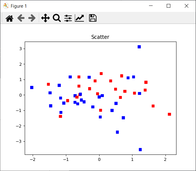
Display point clouds
For data analysis, it is also possible to display scatter plots. In this example, we color the points as a function of a third variable
import matplotlib.pyplot as plt
import numpy as np

plt.close("all")

x = np.random.randn(50)
y = np.random.randn(50)
z = np.random.randint(1,100,50) #np.random.randn(50)

value=(z>50)
colors = np.where( value==True , "red", "#3498db")
fig = plt.figure()
plt.scatter(x,y,marker='s',color=colors)

plt.show()
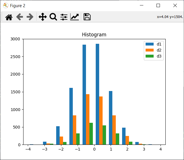
Drawing histograms
For every kind of data, there’s an appropriate representation. In some cases, a histogram is more meaningful.
import matplotlib.pyplot as plt
import numpy as np

plt.close("all")

nb = 10
x_multi = [np.random.randn(n) for n in [10000, 5000, 2000]]

fig = plt.figure()
plt.hist(x_multi, nb, histtype='bar', label=['d1','d2','d3'])
plt.legend(prop={'size': 10})
plt.title('Histogram')
plt.show()
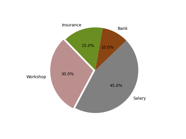
Drawing pie charts
import matplotlib.pyplot as plt

labels = 'Insurance', 'Workshop', 'Salary', 'Bank'
sizes = [15, 30, 45, 10]
explode = (0, 0.05, 0, 0)

fig, ax = plt.subplots()
ax.pie(sizes, explode=explode, labels=labels, autopct='%1.1f%%',colors=['olivedrab', 'rosybrown', 'gray', 'saddlebrown'],startangle=80)
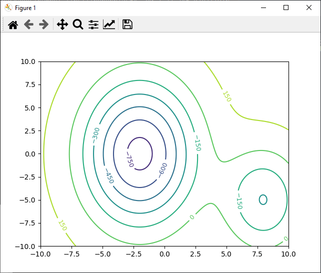
Drawing contours
Contours are useful for plotting 3D data, such as gradients, in 2D.
import numpy as np
import matplotlib.pyplot as plt

def g(x, obs = [[-2,0],[8,-5]], param = [[1000,20, 60],[500,10, 30]]):
	res = 200
	for i in range(0,len(obs)):
		alpha_obstacle, a_obstacle,b_obstacle = param[i]
		x_obstacle , y_obstacle = obs[i]
		res += -alpha_obstacle * np.exp(-((x[0] - x_obstacle)**2 / a_obstacle
								   + (x[1] - y_obstacle)**2 / b_obstacle))
	return res

x = np.linspace(-10, 10, 200)
y = np.linspace(-10, 10, 200)
X = np.meshgrid(x, y)
Z = g(X)

CS = plt.contour(X[0], X[1], Z) #, colors='black')
plt.clabel(CS, fontsize=9, inline=True)
plt.show()
Creating charts with Matplotlib
For a more global visualization of data, an important technique is to be able to draw several graphs on the same figure.
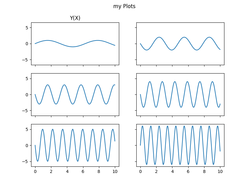
Using subplots
It is possible to divide a figure into rows and columns to organize curves in a more readable way and link axes more easily.
fig = plt.figure()
ax_list = fig.subplots(row, col, sharex=True, sharey=True)
import matplotlib.pyplot as plt
import numpy as np

plt.close("all")

ylist=[]
ylbl = []
x = np.linspace(0, 10, 1000)

for i in range(8):
    y = np.random.choice([-1,1])*(i+1)*np.sin((i+1)*x)
    ylist.append(y)
    ylbl.append('y{}(x)'.format(i))


fig2 = plt.figure(figsize=(8, 6))
fig2.suptitle("my Plots")

#devide figure in 3 rows and 2 columns with shared axis
(row1col1, row1col2),(row2col1, row2col2),(row3col1, row3col2) = fig2.subplots(3, 2,sharex=True,sharey=True)

ax = row1col1
ax.plot(x, ylist[0], label="y1(x)")
ax.set_title('Y(X)')
ax = row1col2
ax.plot(x, ylist[1], label="y1(x)")
ax = row2col1
ax.plot(x, ylist[2], label="y2(x)")
ax = row2col2
ax.plot(x, ylist[3], label="y3(x)")
ax = row3col1
ax.plot(x, ylist[4], label="y4(x)")
ax = row3col2
ax.plot(x, ylist[5], label="y5(x)")
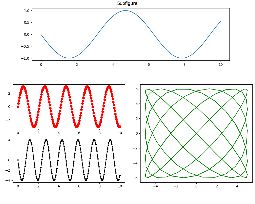
Using subfigures
For more complex layouts, you can use subfigure
fig = plt.figure(figsize=(10, 8))

(row1fig, row2fig) = fig.subfigures(2, 1, height_ratios=[1, 2])
row1fig.suptitle("Subfigure")
(fig_row2left, fig_row2right) = row2fig.subfigures(1, 2)

row1_ax = row1fig.add_subplot()
row2l_axs = fig_row2left.subplots(2,1)
row2r_ax = fig_row2right.add_subplot()

ax = row1_ax
ax.plot(x, ylist[0])
ax = row2l_axs[0]
ax.plot(x, ylist[2],'ro-')
ax = row2l_axs[1]
ax.plot(x, ylist[3],'k.-')
ax = row2r_ax
ax.plot(ylist[4], ylist[5],'g-')
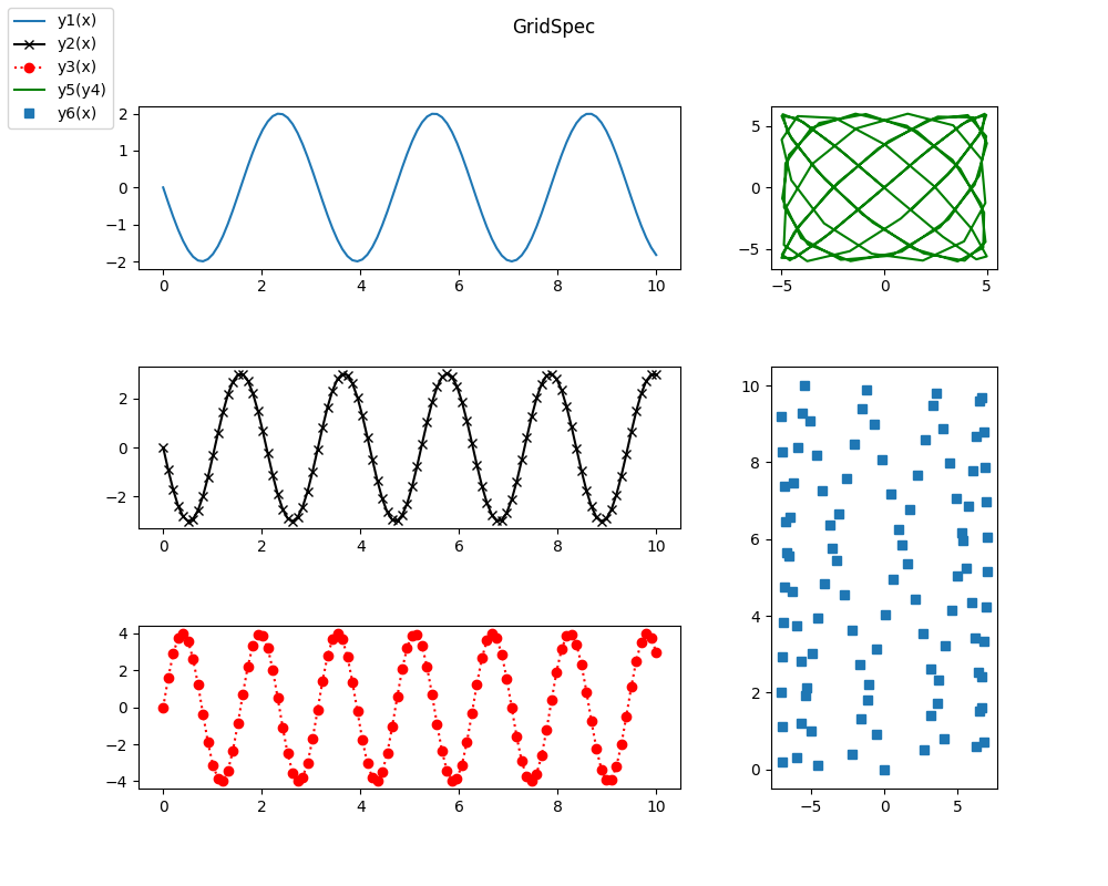
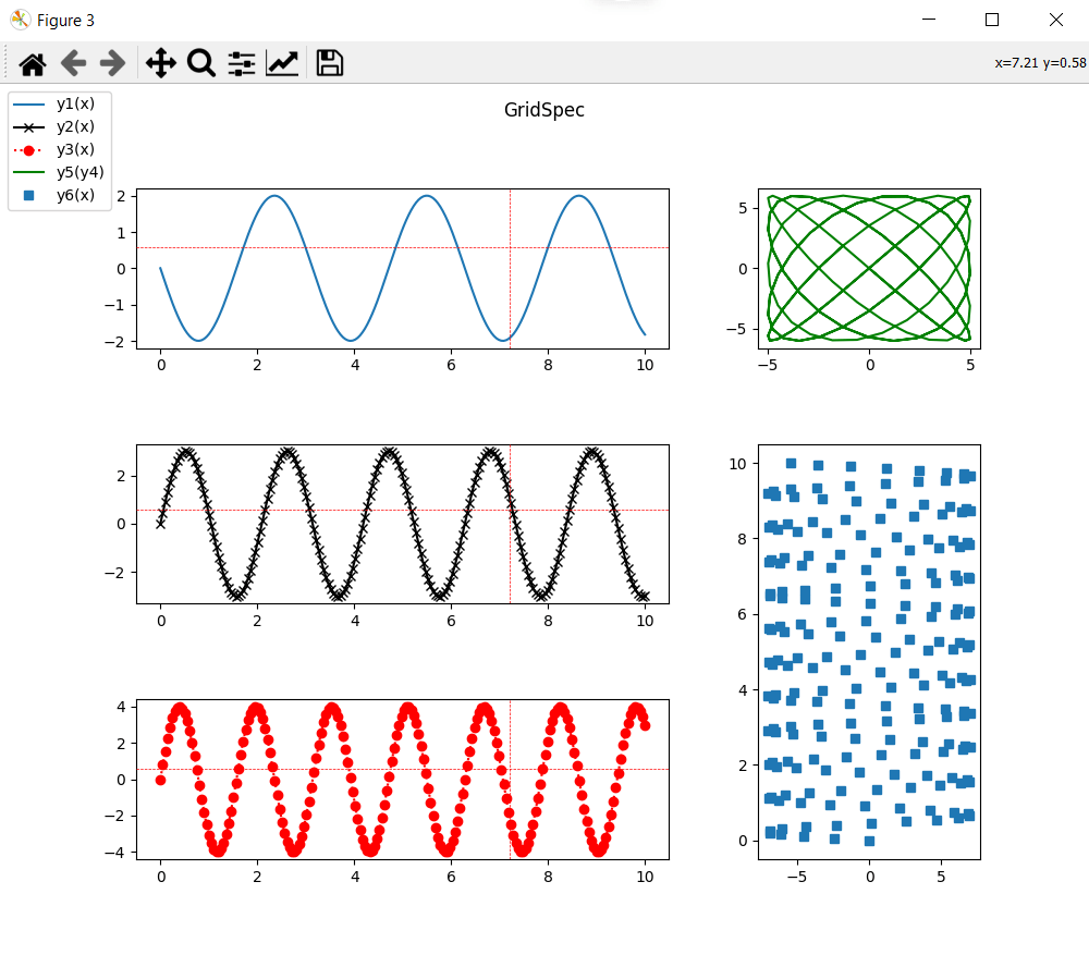
Using GridSpec
With GridSpec, you can quickly draw complex layouts. Rather than dividing zones successively, we’ll define a grid that we’ll fill as we go along with sub-graphs.
fig = plt.figure(figsize=(10, 8))
fig.suptitle("GridSpec")
gs = plt.GridSpec(3, 3)
gs.update(wspace=0.4, hspace=0.6)

col1fig0     = fig.add_subplot(gs[0, :2])
col1fig1     = fig.add_subplot(gs[1, :2],sharex=col1fig0)
col1fig2     = fig.add_subplot(gs[2, :2],sharex=col1fig0)
col2fig0     = fig.add_subplot(gs[:1, 2])
col2fig1     = fig.add_subplot(gs[1:, 2])


ax=col1fig0
ax.plot(x, ylist[1], label="y1(x)")
ax=col1fig1
ax.plot(x, ylist[2], 'kx-',label="y2(x)")
ax=col1fig2
ax.plot(x, ylist[3], 'ro:', label="y3(x)")
ax=col2fig0
ax.plot(ylist[4], ylist[5], 'g-',label="y5(y4)")
ax=col2fig1
ax.plot(ylist[6],x,'s',  label="y6(x)")
fig.legend(loc='upper left')
N.B.: You can combine subfigure, subplot and gridspec and nest them as you wish to create your most beautiful graphics.
Add a cursor to your graphics
For better readability, you can add a cursor to visualize certain details more precisely. This cursor can be shared between several curves. We can, for example, add a cursor to the three curves on the left of the previous figure and define these parameters
- ls linestyle
- lw linewidth
- color
- horizOn horizontal line
- greenOn vertical trace
from matplotlib.widgets import MultiCursor
figlist = (col1fig0,col1fig1,col1fig2)
cursor = MultiCursor(fig.canvas, figlist, color='r',lw=0.5, ls='--', horizOn=True,vertOn=True)
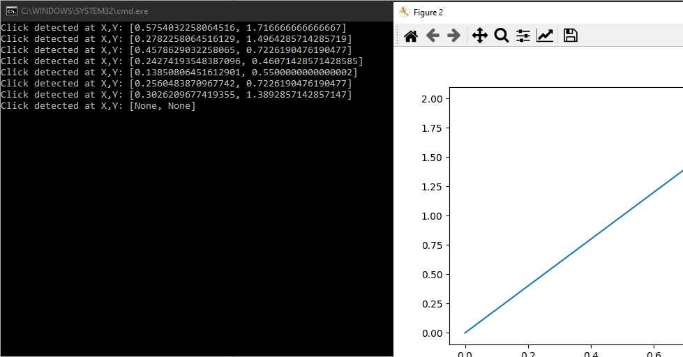
Detecting mouse events
In addition to drawing and animating curves, you can also use the mouse to interact with the graph.
import numpy as np
import matplotlib.pyplot as plt
from matplotlib.backend_bases import MouseButton

def on_click(event):
	if event.button is MouseButton.LEFT:
		print("Click detected at X,Y: {}".format([event.xdata, event.ydata]))
fig = plt.figure()
plt.plot([0,1],[0,2])
plt.connect('button_press_event', on_click)

plt.show()
Creating an animation with Matplotlib
You can create animated graphics and save them in various formats using the matplotlib.animation tool. To do this, draw the graph frame by frame in an update(frame) function, which returns the object containing the graph (in this case curve).
import math
import numpy as np
import matplotlib.pyplot as plt
import matplotlib.animation as animation

#create data
#process data
x = np.linspace(0, 10, 100)
y =  np.sin(2*x)

# plot first point
fig = plt.figure()
curve = plt.plot(x[0], y[0])
plt.axis([0, 10, -1.2, 1.2])

def update(frame):
    # update data
    xi = x[:frame]
    yi = y[:frame]

    # update plot
    curve[0].set_xdata(xi)
    curve[0].set_ydata(yi)
    return (curve)

#display animation
ani = animation.FuncAnimation(fig=fig, func=update, frames=100, interval=30)
plt.show()
#save animation as gif
ani.save(filename="./tmp/sinewave.gif", writer="pillow")
There are different ways of creating animations depending on your data types. You can also save animations in different formats depending on their use. Please consult the Animation documentation.
Applications
- Displaying data from a Lidar sensor
- View camera images
- Visualize your algorithms and data